Logo (and Website) design for Project SEKAI CTF, both the team and the contest.
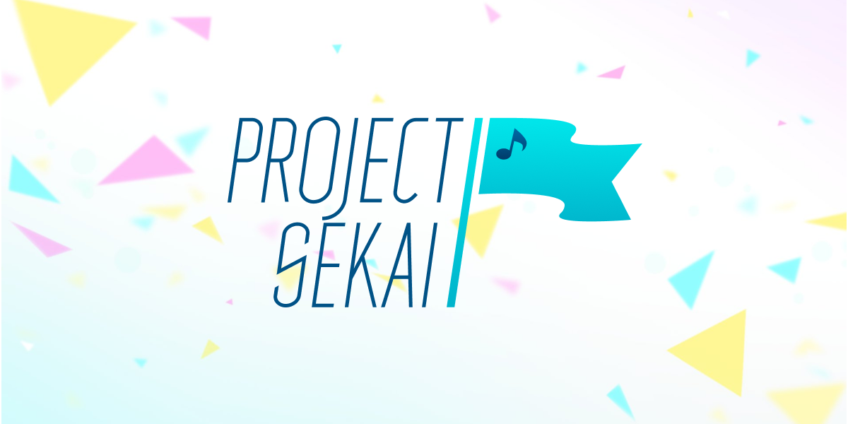
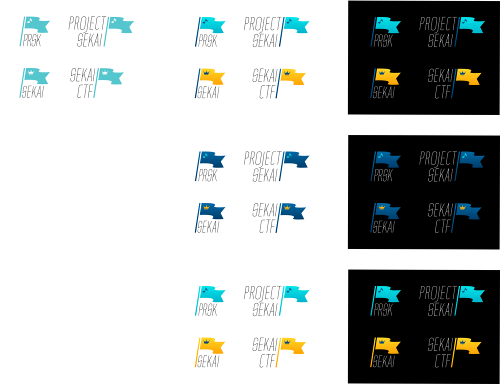
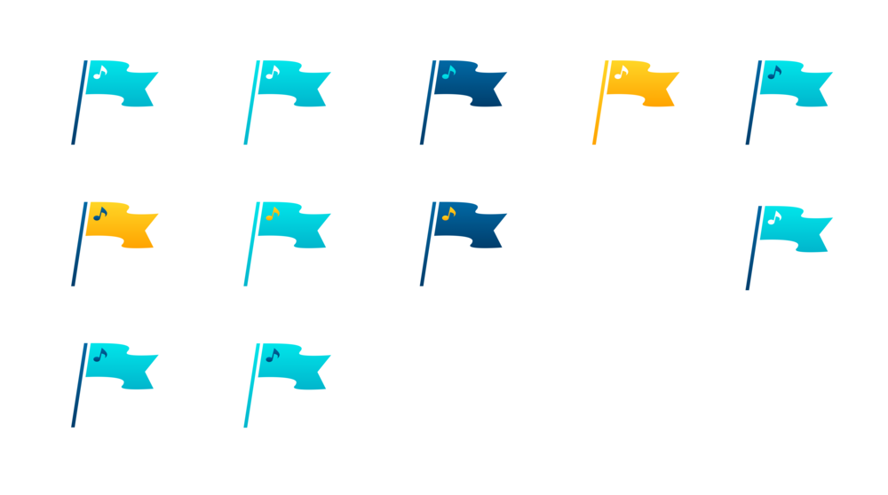
The logo mark features a flag, with a music note on the team logo, and a crown on the contest logo. The color scheme and the music note are reminiscences of the previous logo, which is a close trace of the logo of the game Project SEKAI: Colorful Stage feat. Hatsune Miku, which is the origin of the team name. The flag in team logo uses a cyan gradient which is the main color scheme of the game, and that of the contest logo uses a yellow gradient to represent the crown.
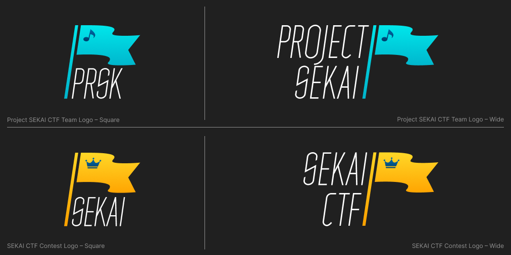
Each logo also features a tiny variant, to be used in smaller locations such as favicons. The tiny variant has a larger icon (music note/crown) for a better visibility, the logotype is also omitted.
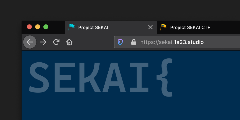
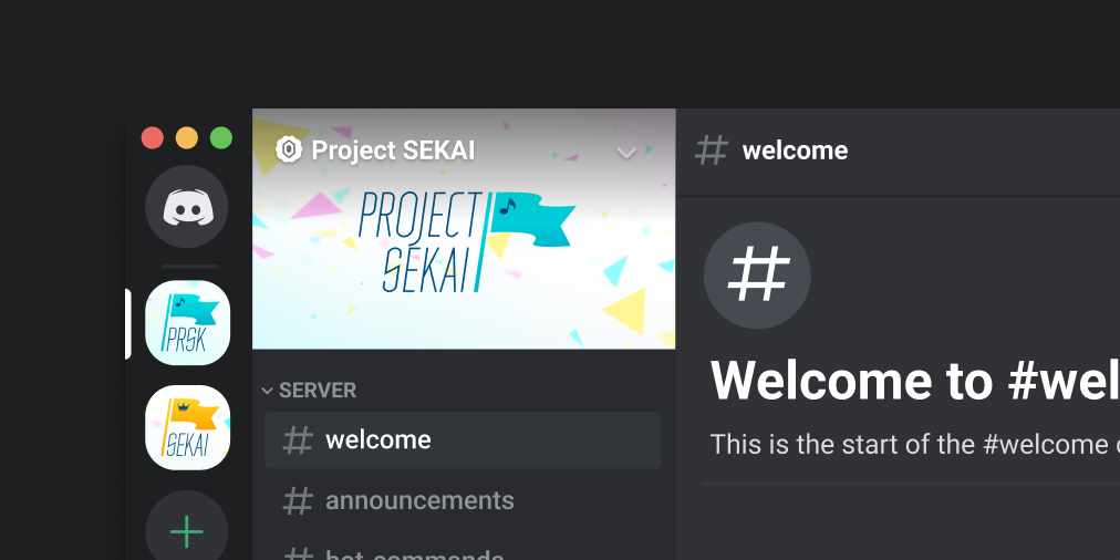
To avoid an awkward blank when applying the logo to a plain white background, the in-game colorful fragments background is used to fill the blank. For square profile pictures, a different crop location is used for each logo (blue gradient for the team, and yellow gradient for the contest), and for banners, the entire picture (center-fit) is used.
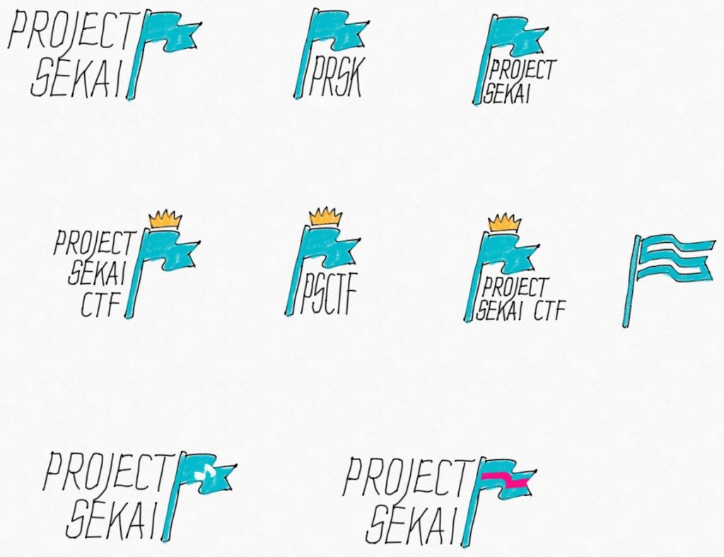
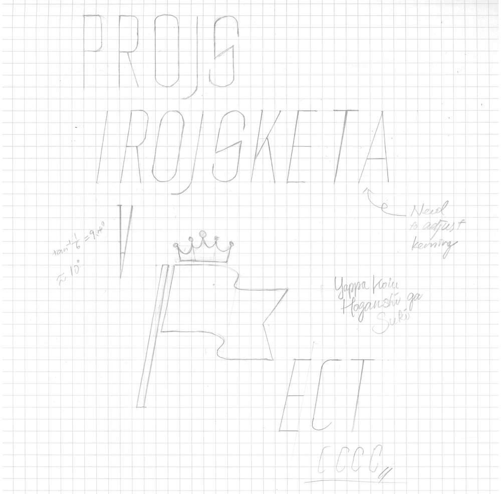
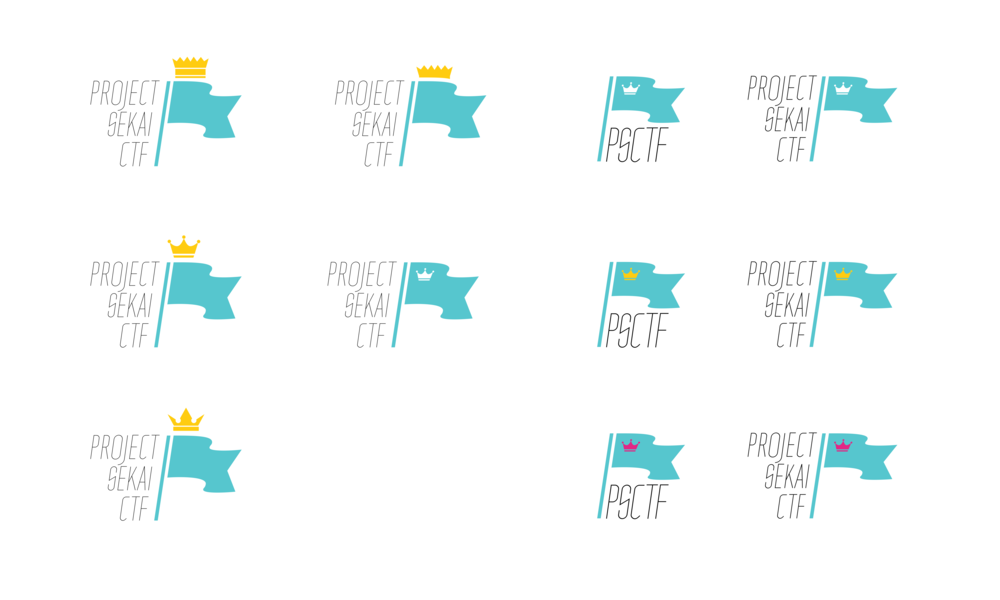
Below are some of the sketches made during the design process.
Besides the logo, I also “designed” the website of the CTF team, which is basically a heavily modified version of the Tailwind Next.js Starter Blog.
The original logo of the team was a trace over the logo of the game Project SEKAI: Colorful Stage feat. Hatsune Miku, with the wording modified for the team.
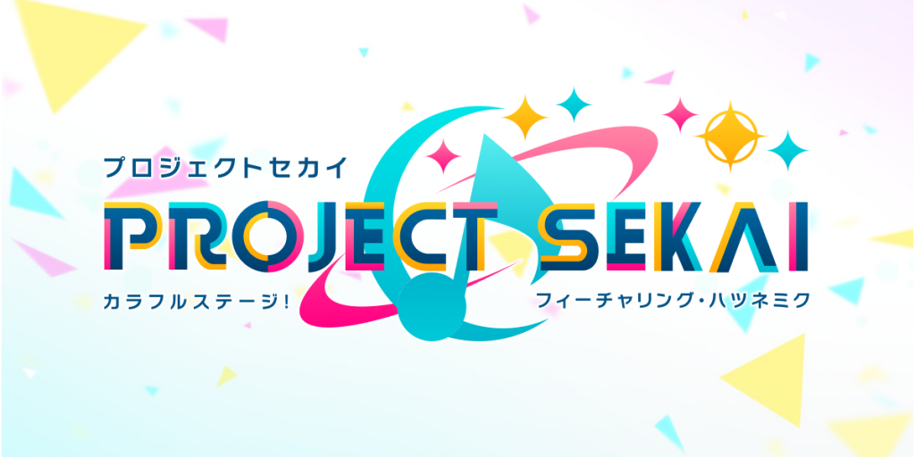
Below is a comparison of the two logos.
