
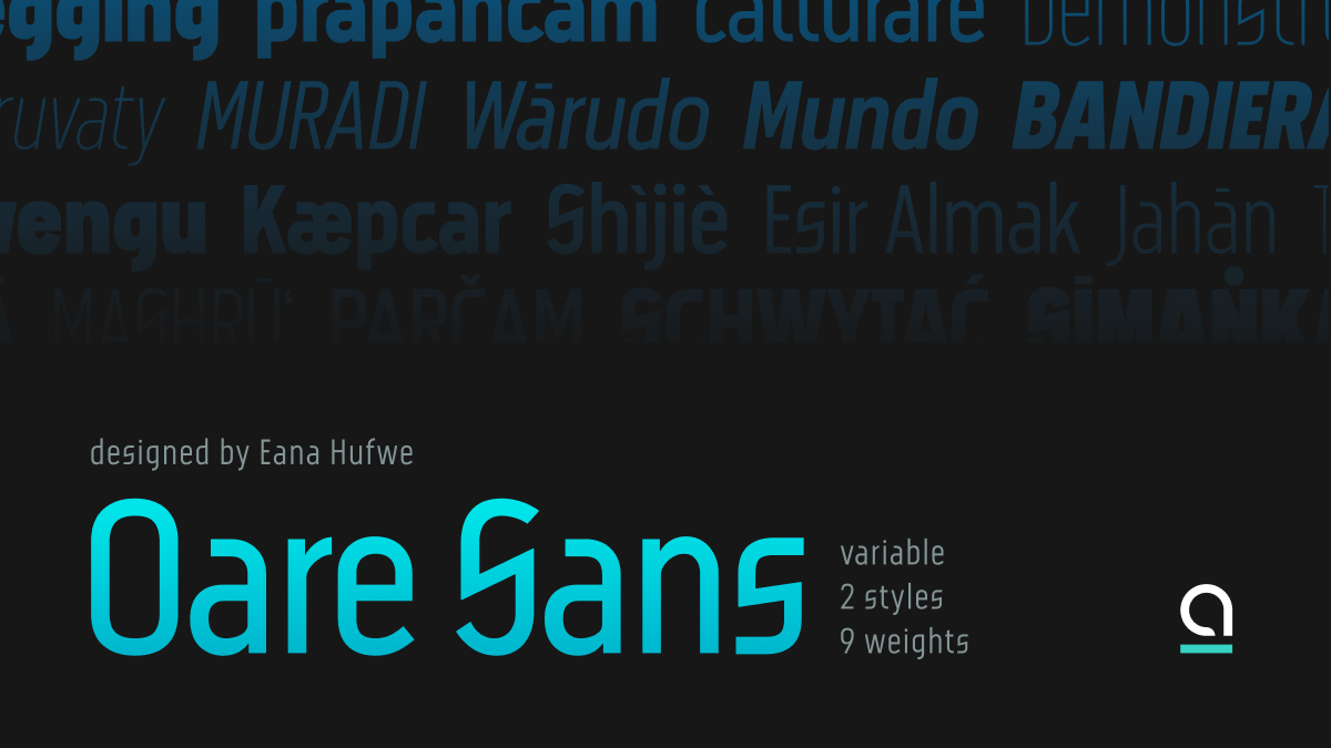
oare n. [o.ˈa.ɾɛ] moon
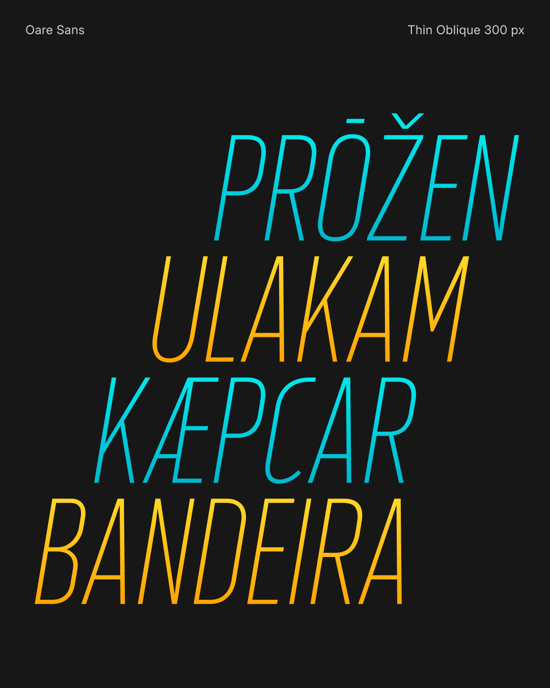
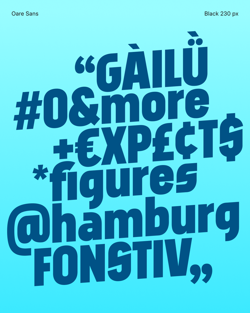
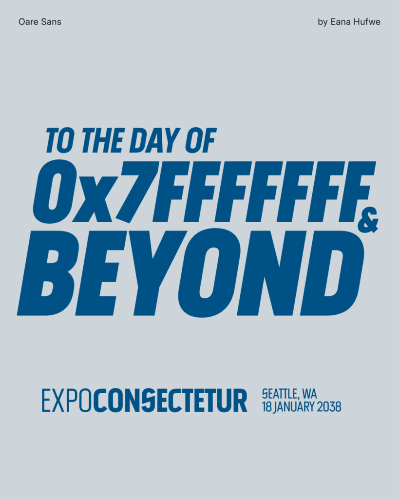
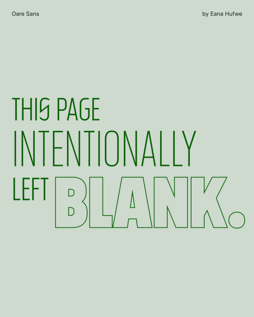
Oare Sans is a condensed display sans-serif typeface that combines narrow proportions with open apertures and distinctive letterforms. Letters such as C and S bring an open quality to its compact design, while the uppercase J descends below the baseline, its tail pairing with the curve of the preceding letter.
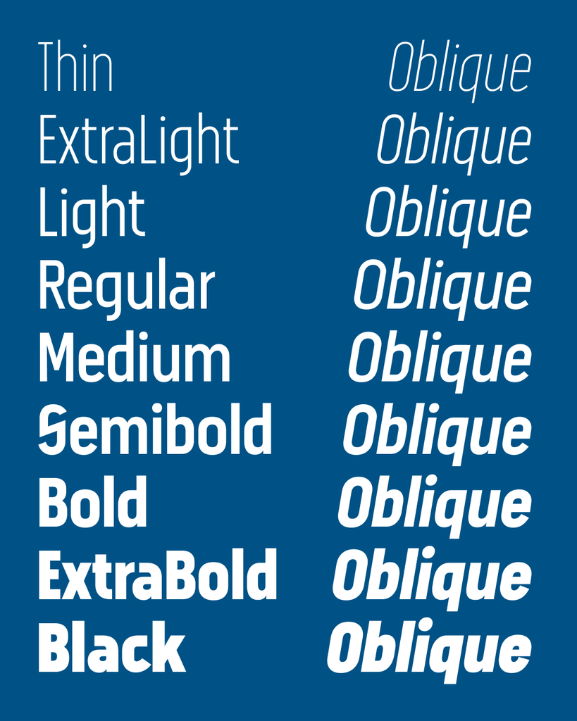
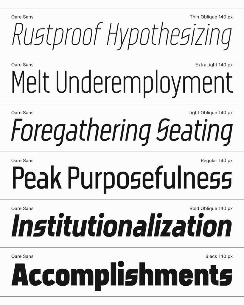
A variable weight axis spans Thin (100) to Black (900), offering a range from fine strokes to dense, emphatic shapes. A separate slant axis allows the letterforms to lean into oblique styles, giving designers independent control over weight and slant.
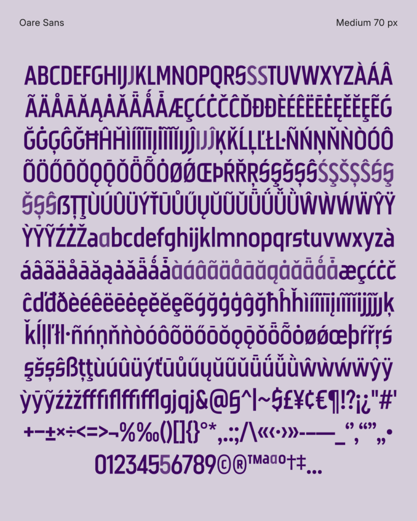
OpenType features include stylistic sets for alternative letterforms, common ligatures, and case-sensitive forms for uppercase settings. Oare Sans covers the GF Latin Core character set, with additional support for common Pinyin diacritics.
OpenType Features
- Kerning
kern, Ligauturesliga, Ordinalsordn, Glyph Composition/Decompositionccmp - Localized Forms
locl: MoldavianMOL, RomanianROU, TurkishTUR, DutchNLD, and CatalanCAT - Stylistic Sets
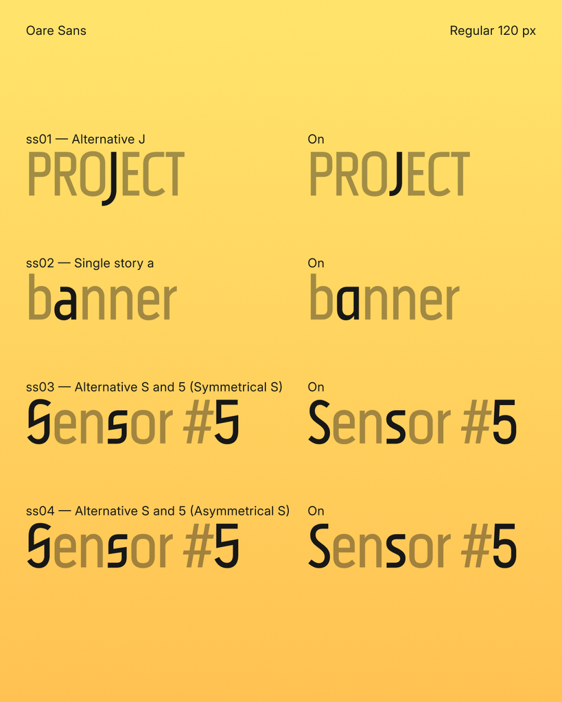
ss01: Alternative Jss02: Single story ass03: Alternative S and 5 (Symmetrical S)ss04: Alternative S and 5 (Asymmetrical S)
Preview
License
Copyright (c) 2026 Eana Hufwe, 1A23 Studio (https://1A23.studio), The Oare Sans Project Authors
This Font Software is licensed under the SIL Open Font License, Version 1.1.
This license is in this repo LICENSE.md, and is also available with a FAQ at:
https://openfontlicense.or
Trivia
This typeface is an expansion of the custom logotype created for PSCTF from a limited set of letters to cover the GF Latin Core character set, and with variable expansion from Thin to Black and Regular to Oblique. This design was initiated from the desire to create a typeface that would match the initial design of the unconventional letter shapes of S and C. The name “Oare” is also named after the Luna CTFd theme commissioned by the same team.
