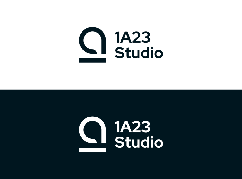
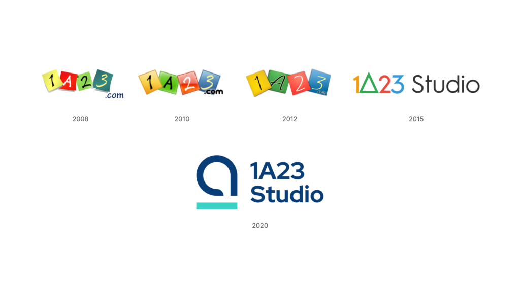
This is the fifth iteration of logo for 1A23 Studio, and the first one that got rid of the old yellow-green-red-blue color scheme (which I always had a hard time remembering the order).
This is also the logo which by far I have spent the most time at. I did a lot of research on color choices, researching for concepts online (mostly Dribbble and Behance), looking for inspirations from books, so on and so forth. By far I’m satisfied with the outcome myself. This logo is simple, straight forward, and clear at small sizes among all the ideas I have brainstormed. You can scroll down to the bottom half to see some of the past ideas I have drawn out for this logo design.
Along with the logo, I have also redesigned the WordPress theme for this portfolio site. The name “Tìtsyul Amip” is a phrase in the Na’vi language, means “a new start”. This logo replaces the fourth one to celebrate the start of a fresh phase of my own life.
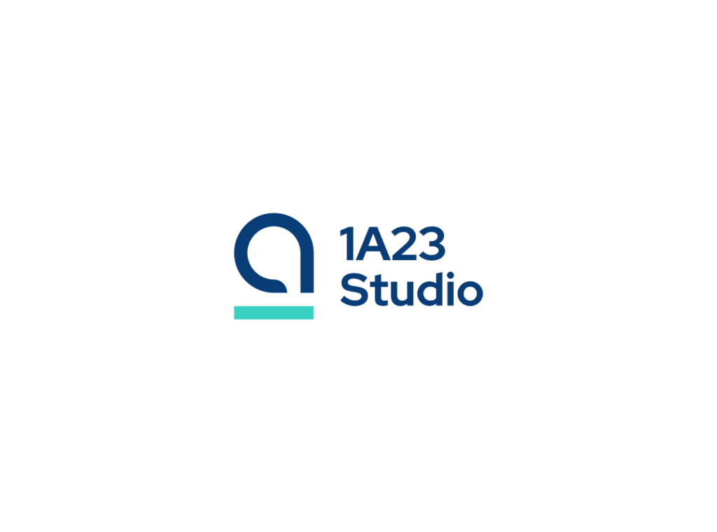
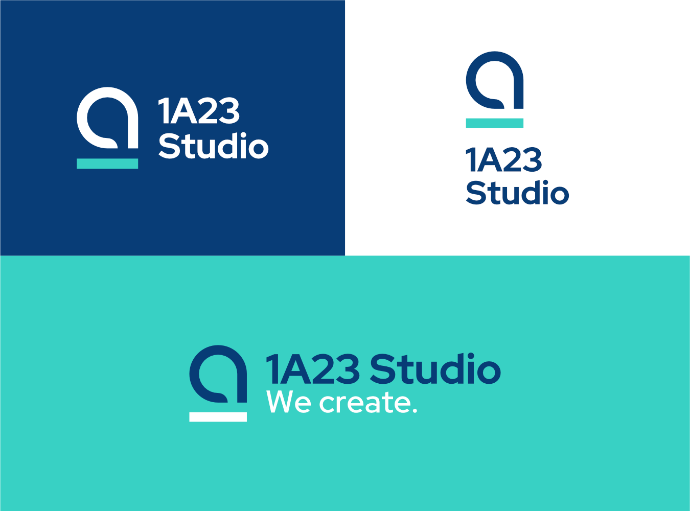
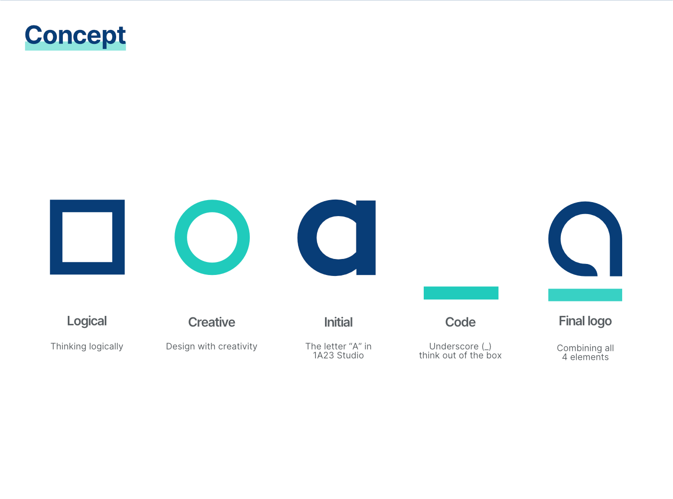
Concept of this logo combines a square, a circle, the letter “a”, and an underscore. Square signifies logic, and circle signifies creativity. “A” as a significant letter, is the only letter in 1A23, and appeared twice in my pseudonym – Eana Hufwe. Underscore is a common symbol in programming languages used widely in names of identifiers. The logo can also be constructed with a grid system using only simple geometric shapes of rectangles and circles.
Showcase


Design concept 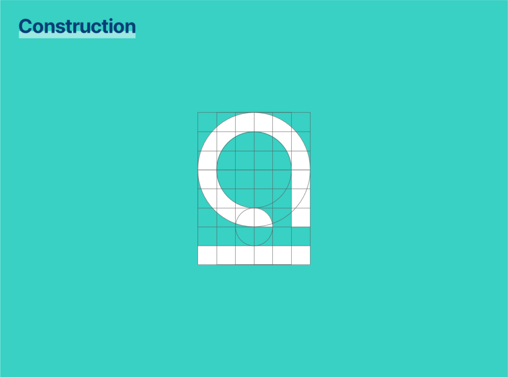
Construction 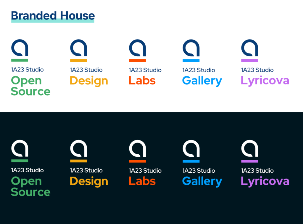
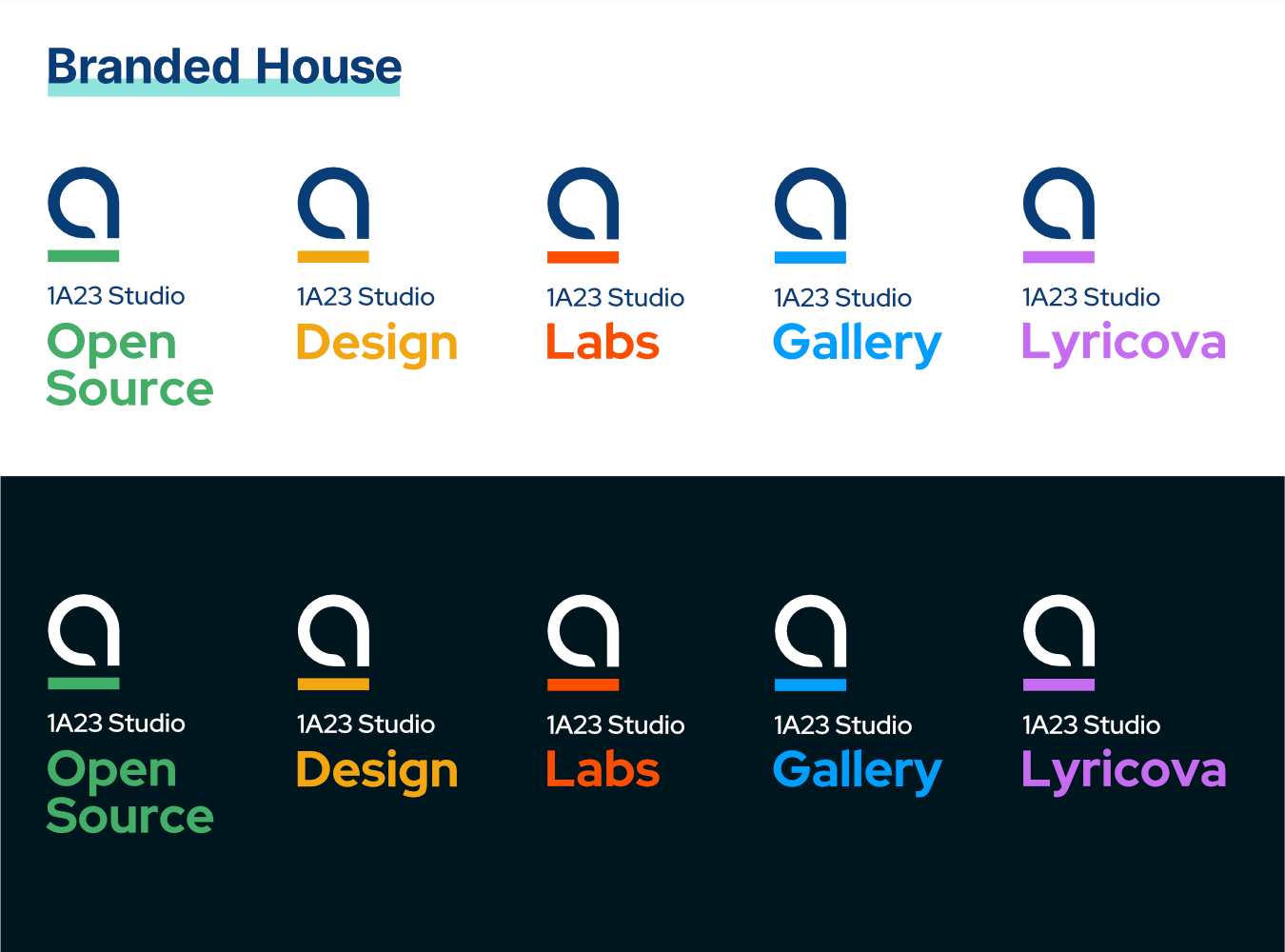
Branded house 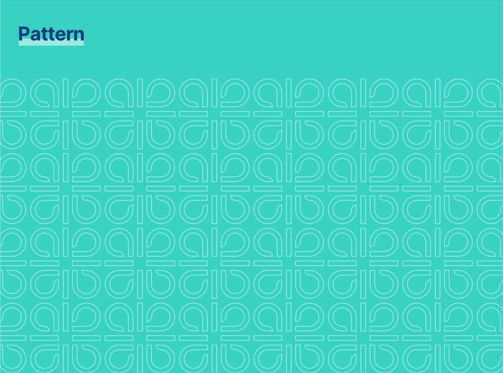
Pattern 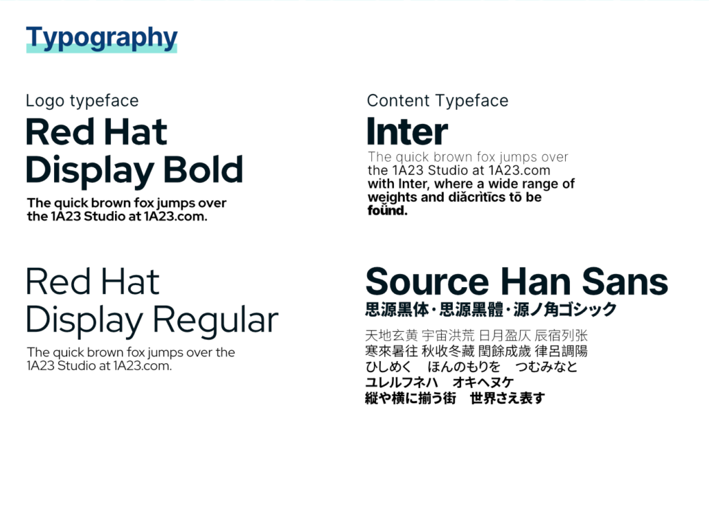
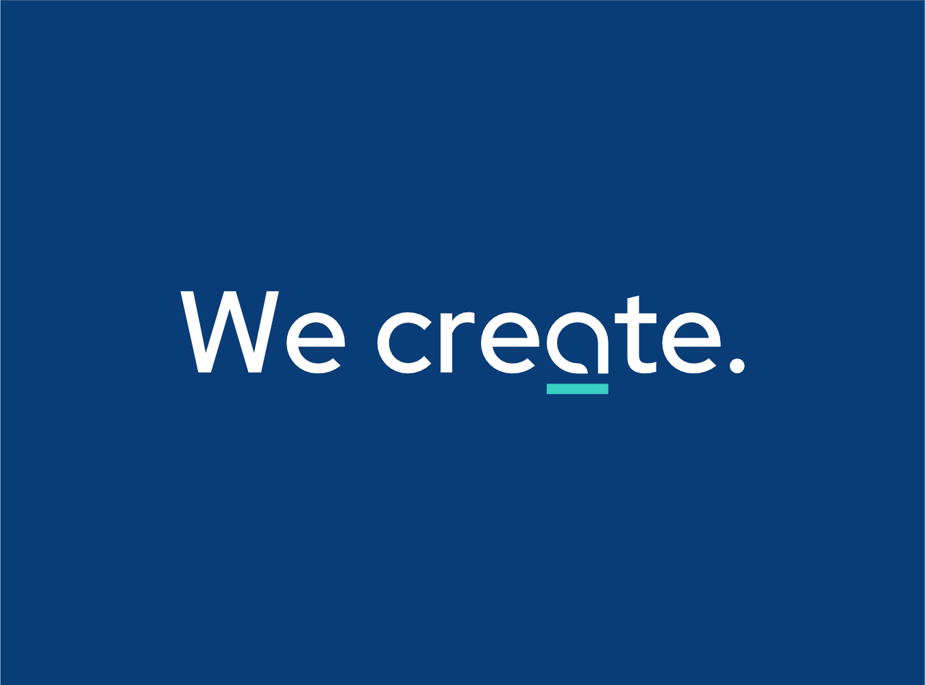
Typography 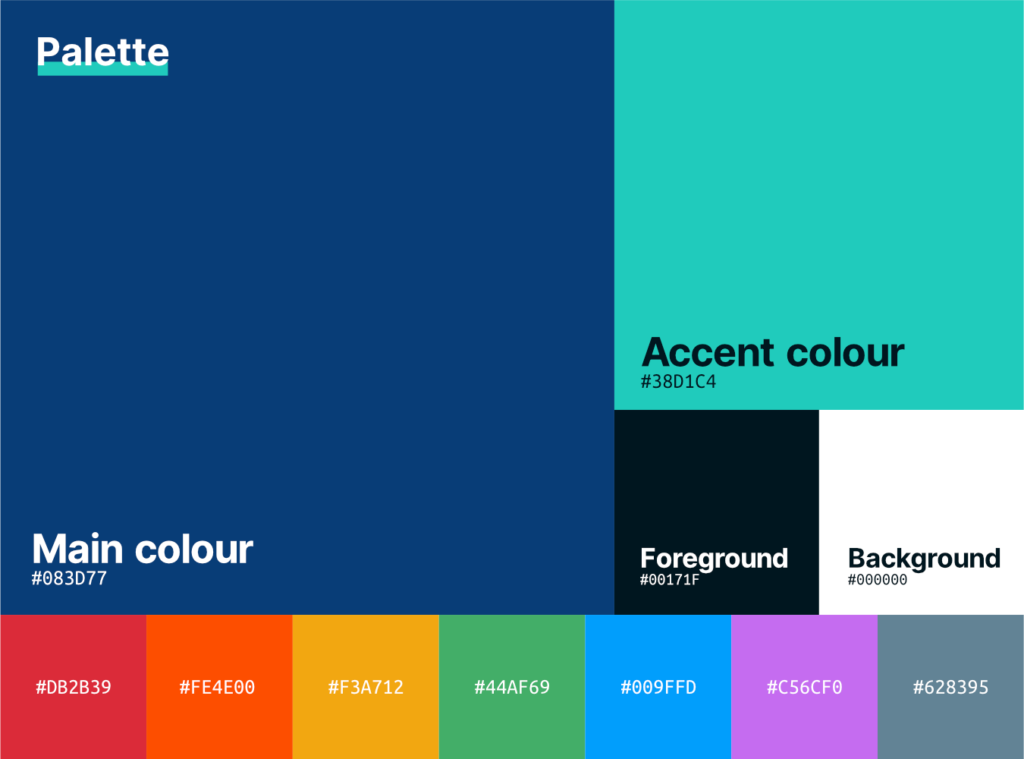
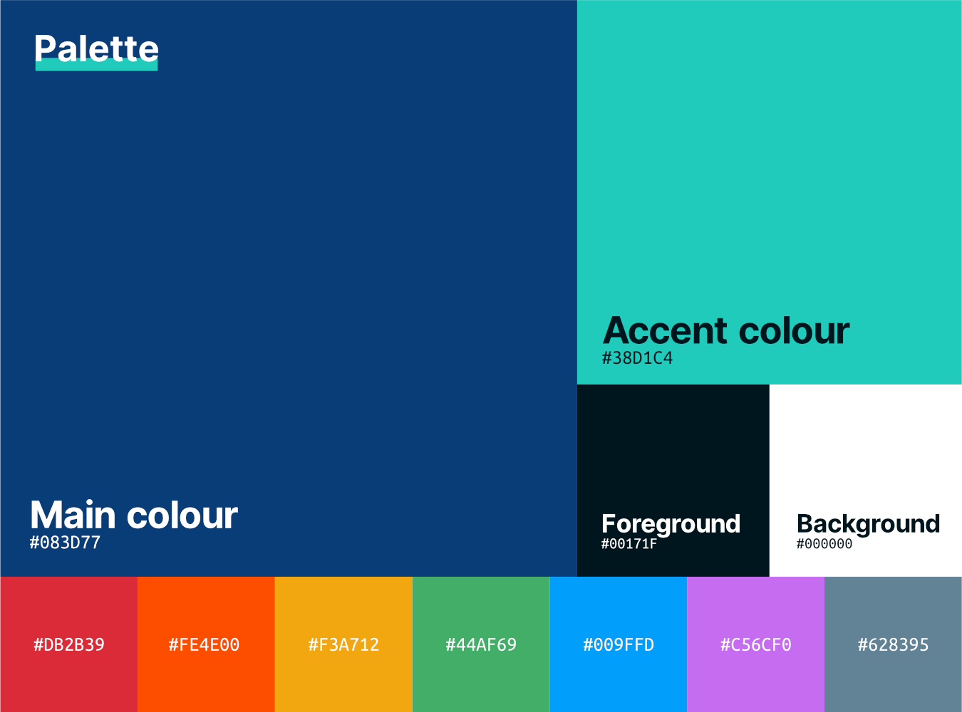
Pallete 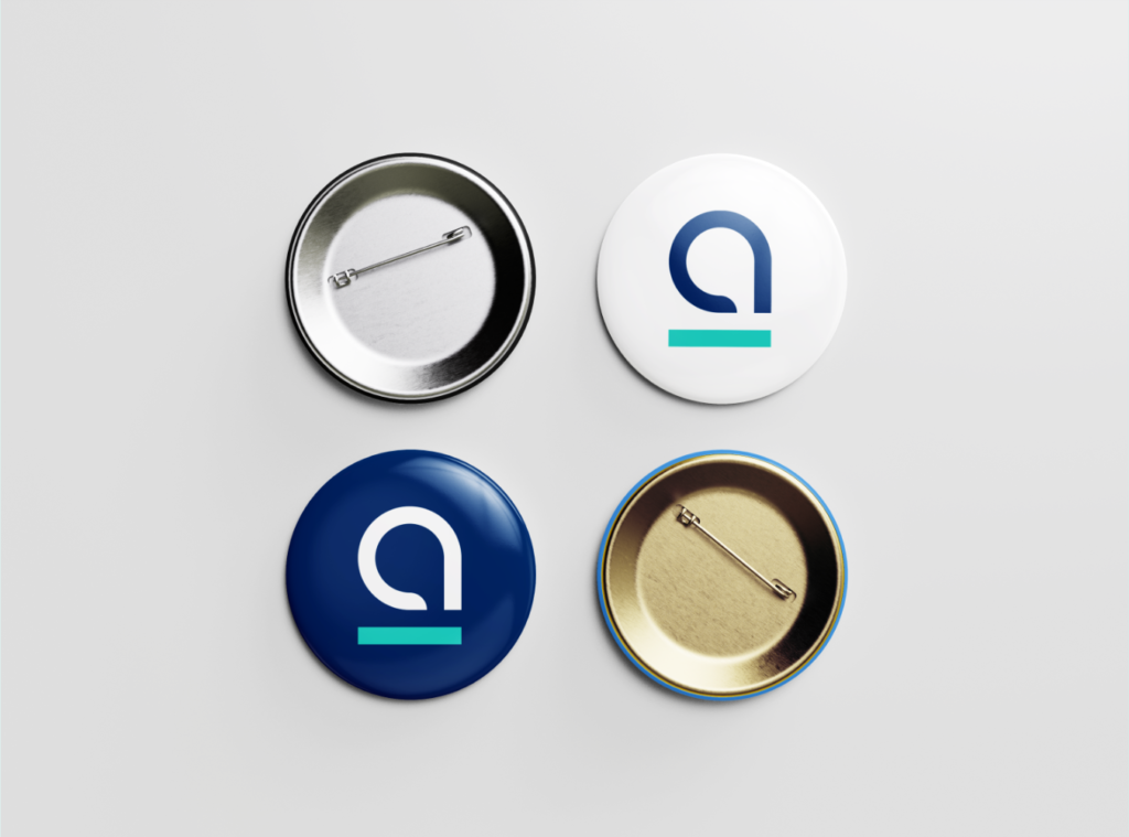
Mockup: badge 
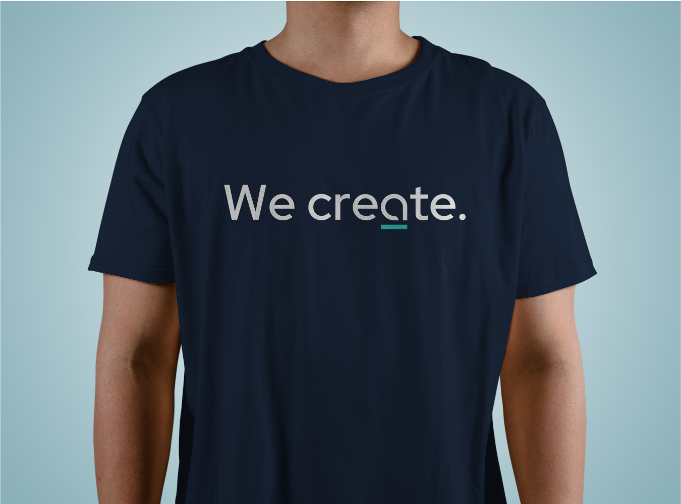
Mockup: t-shirt 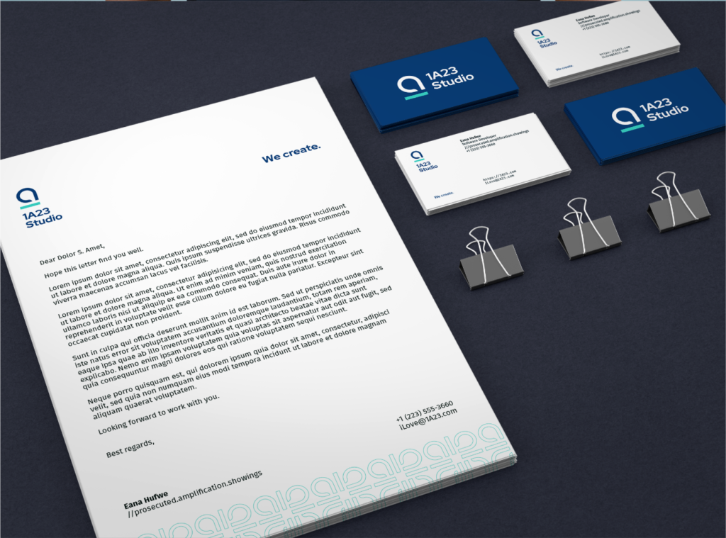
Mockup: stationary


Early sketches
Most of the early sketches are done on my Android phone while I was in the middle of something else, and later refined on my iPad. The cross-platform sync feature of OneNote is really helpful in this case. Just that those colorful rainbow fills aren’t available on the Android app, and replaced with the bright neon colors instead, which sometimes could look really ugly.
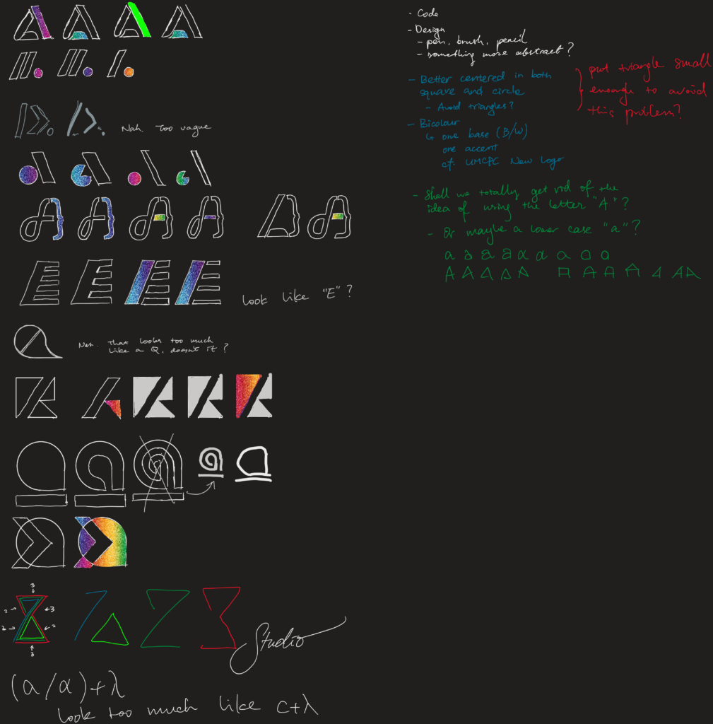
I then drew out each of the sketched logo into vector graphics and dropped out some that are out of balance. Below are the 20 logos I had in the first shortlist, and some sketches made during the review.
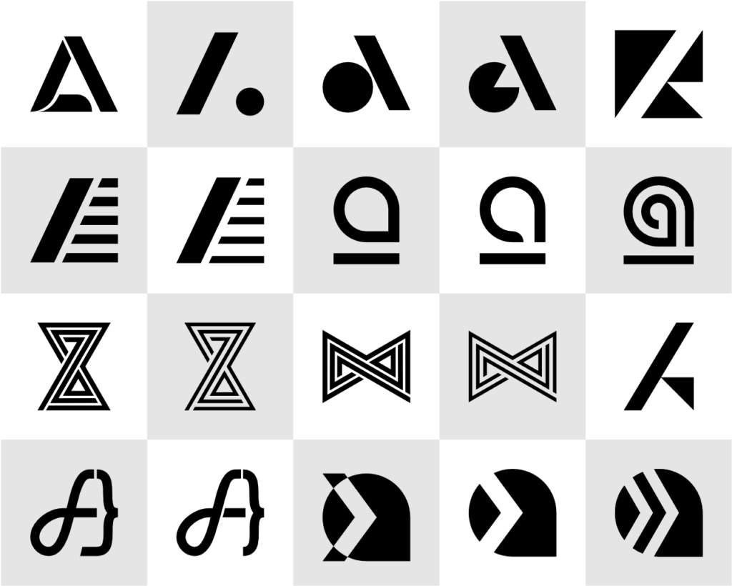
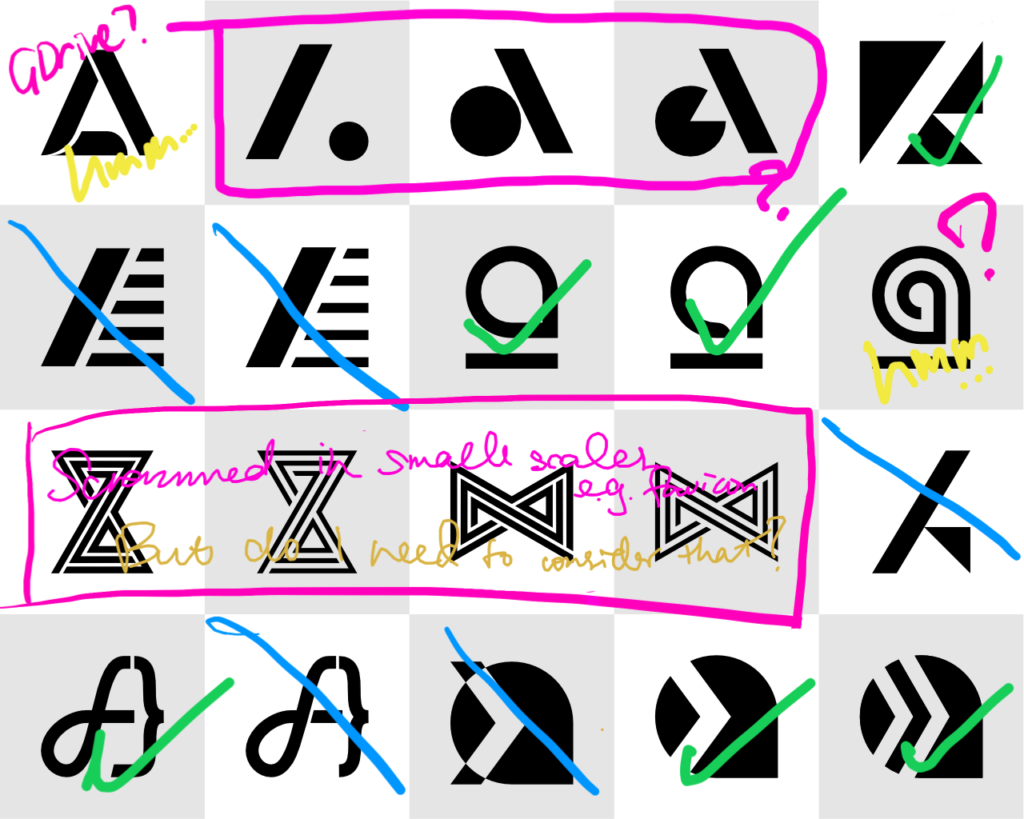
Some of the reasons behind dropping these sketches
- First one resembles Google Drives a lot
- First four on the third row looks too scrammed at smaller scales
- The last one on the third row doesn’t look balanced
- Rest of them are simply not of my taste 😛
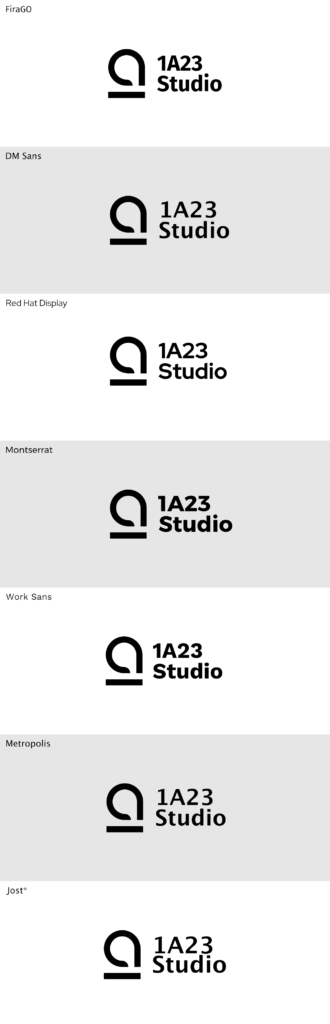
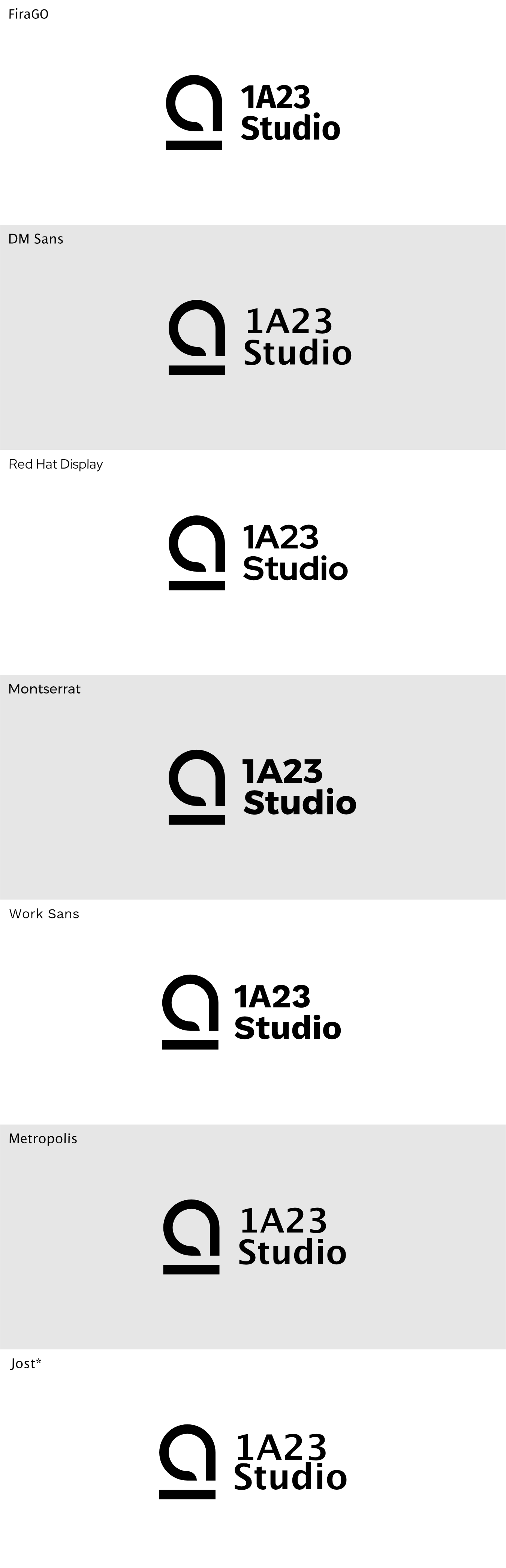
Finally, testing the logo lockup with a bunch of free fonts (since nobody is going to pay for typefaces for me). It turns out Red Hat Display looks quite nice with my logos, although it might feel a bit weird using typefaces made specifically for other brands on my own logo, even it is open source.
Typefaces 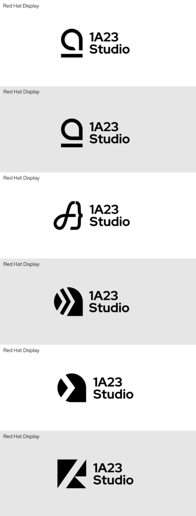
Logo lockups
Before and after
Digging through my archive of all the design stuff, I finally managed to get on hand with all the past 4 iterations of logo for a comparison. I only started to use vector design tools starting at Iteration 4. The first three may look a bit blurry because I didn’t make an HD version back then.
Download
For those who want to use my logo on your website, for example, link exchanging, please use the archive below. This archive includes the logo in different shapes and variants. Bolded in the list below are the preferred variants. Please use the preferred ones whenever possible.
- Shapes
- ⟶ Square
- ⟶ Lockup
- Lockup portrait
- Banner
- Lockup portrait (blog)
- Lockup (blog)
- Square (blog)
- Colors
- ⟶ Primary
- ⟶ Background
- Accent
- Foreground
- Black
- White